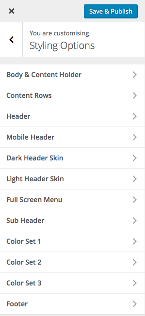
Styling Options
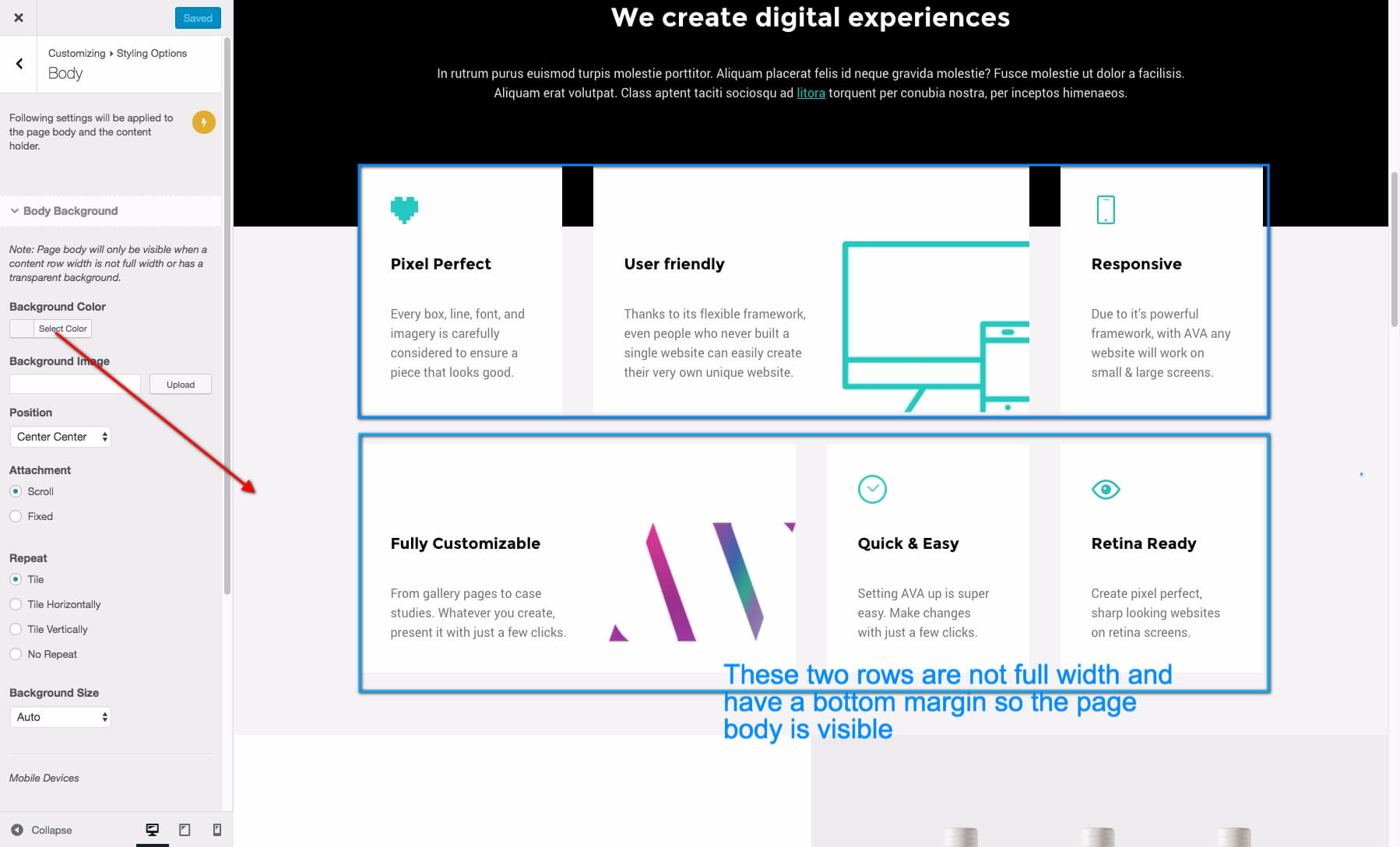
- Body & Content Holder: You can change several settings for the body. These settings are global and there are same settings available for each page/post. Note: Page body will only be visible when a content row width is not full width or has a transparent background. It will be visible in categories and default page/posts.
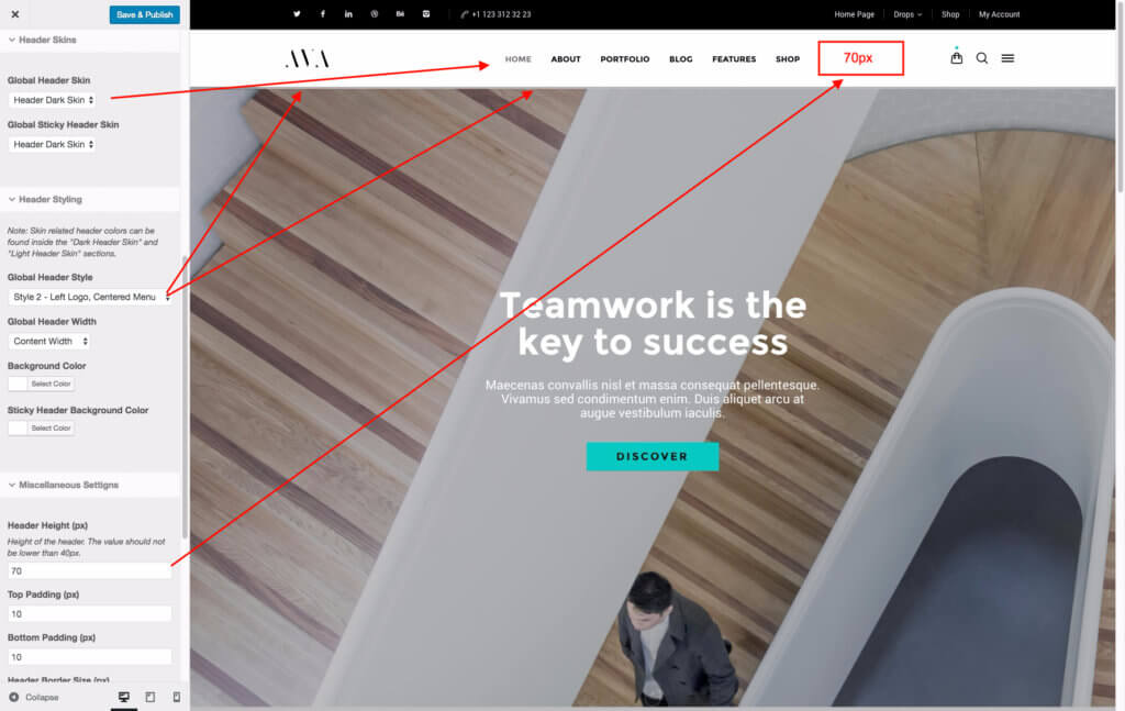
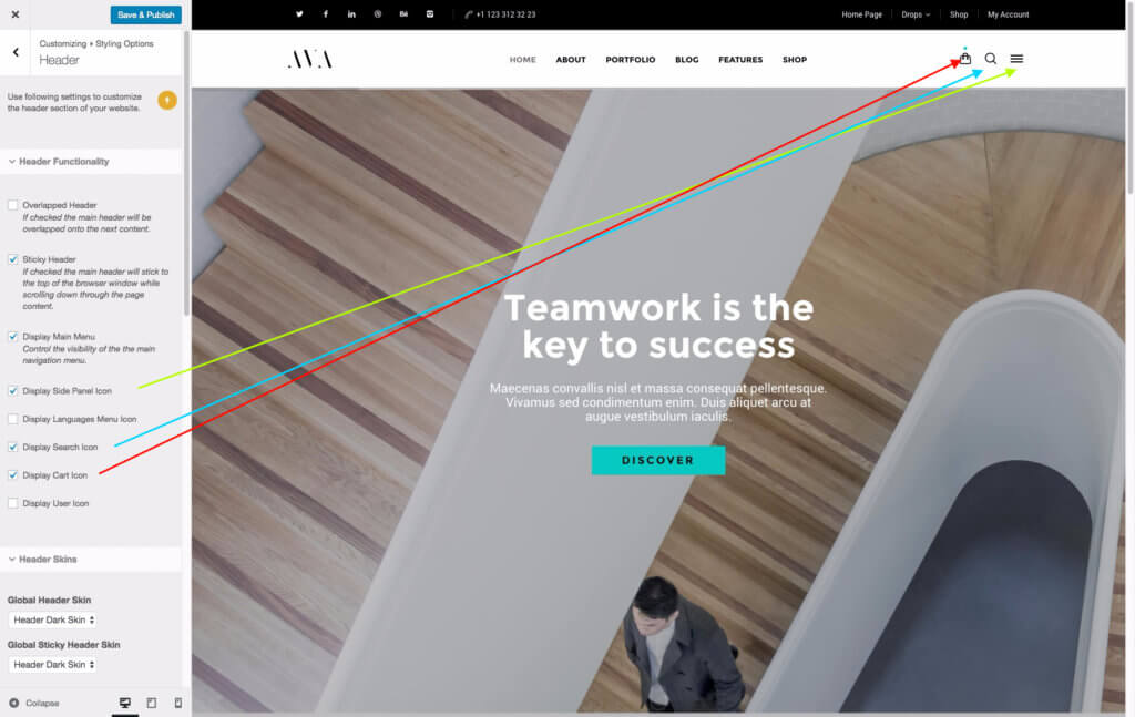
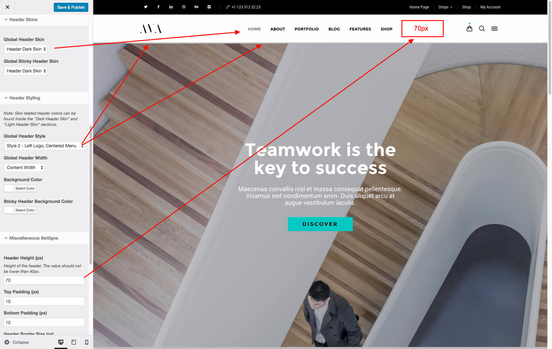
- Header: This part will allow you to customize the header bar that includes the logo and the navigation bar of your website.
- Mobile Header: This color used for the header for small screens which is possibly a mobile device such as mobile phone, tablets.
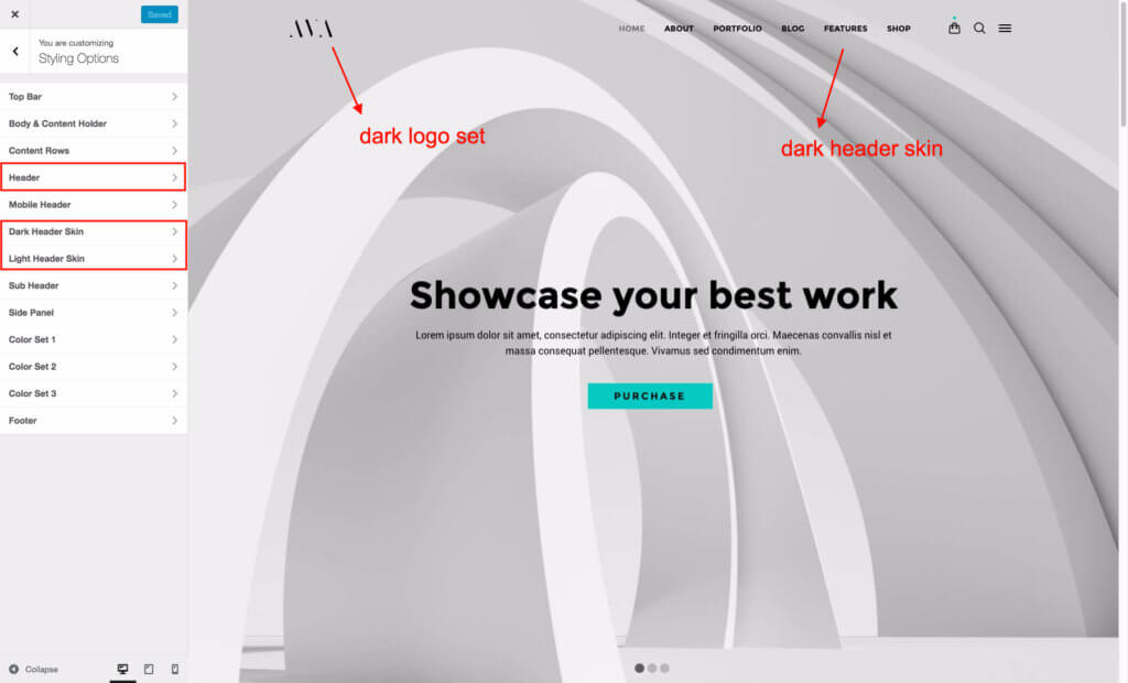
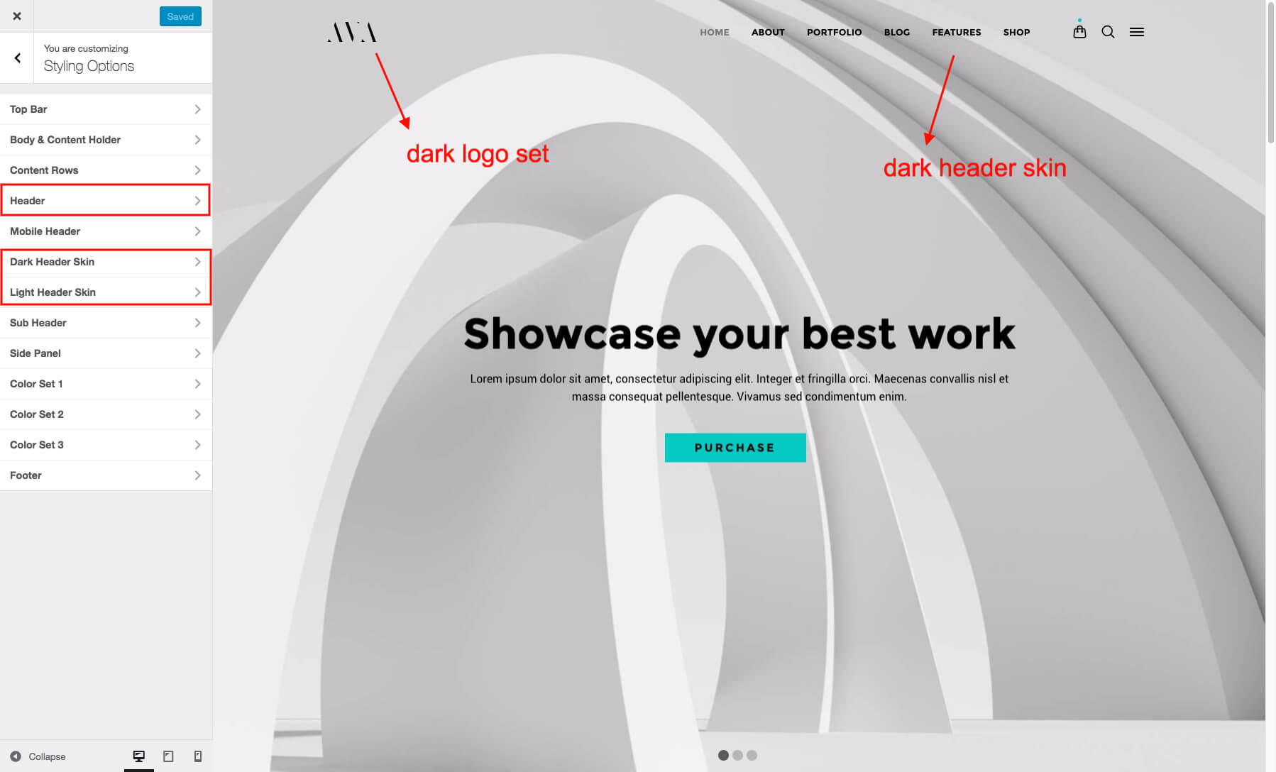
- Dark / Light Header Skins:
There are two color sets available for the header. Each color set contains same variables for the header such as text, border, navigation item colors etc. We have created one with darker colors to be used with a darker logo image on a light background and the other one with light colors on a dark colored background. There are also two logo sets available with the same logic that linked to these color sets.For example, we’ve used the light header skin for this page http://ava-demo.rtthemes.com/ and customized the header background color of the page as transparent inside the page design options individually since it is overlapped on a darker slider image. When you scroll down, the page “sticky header” picks up the dark color set on a white header background. Use header skins to;
- Customize menu colors
- Customize sub menu colors
- Header line colors
- Header font colors

- Side Panel: Use the color set to customize colors of the fullscreen menu that also contains the search form.
- Sub Header: Sub header is the part that contains the page title and the breadcrumb menu of a page.
- Shortcut Buttons: This part is referring the icons where the top right on the page. You can enable/disable those icons and change their styles.
- Color Sets:
Color sets are used to for content rows or columns. These are color schemes that allow you create a different look for your each content blocks. There are three of them available. The first one is the default color set of the theme. You are able to select a color set for a row or column or some modules like portfolio posts / carousels when you editing a page by using Visual Composer.Note : When different color schemes are selected for nested rows and columns, the results may not be what you expect it to be because of the order of loading of the scheme in the CSS files. Basically, it will follow the order of the scheme list to overwrite the one before. So loading a preset Color Set 1 into a Color Set 3 might not work as the Color Set 1 is loaded before the 3.
- Footer: Customize the footer area